Word cloud tutorial in Excel
This tutorial will show you how to generate and interpret a Word Cloud in Excel using the XLSTAT software.
Dataset for creating a word cloud
In this tutorial, we will use data from the stateoftheunion.onetwothree website regarding the latest «State of the Union speeches» by Presidents D. Trump and B. Obama whose full texts can be obtained at: http://stateoftheunion.onetwothree.net/texts/20160112.html for President Obama. http://stateoftheunion.onetwothree.net/texts/20170228.html for President Trump.
A word cloud is a visual representation of the most used keywords or terms in a text. The font size of a keyword into a Word cloud is proportional to its frequency. The font color can also indicate the importance of the keyword.
Setting up a Word Cloud using XLSTAT
Once XLSTAT is open, select the XLSTAT / Visualizing data / Word cloud command (see below):
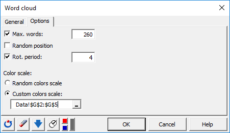
 The dialog box for the Word cloud appears.
 In the General tab, select column B in the Frequency term matrix field and column A in the Term labels field. These data represent Obama’s speech.
Enable the Variable labels option since the first row of data contains a header. In the Options tab, we choose to activate the Max. words options. and Rot. period in order to limit the number of words to display in the cloud (here 260 words maximum) as well as to perform a periodic vertical rotation of a word at a defined period (here we have chosen to orient vertically 1 word every four).
By default, the Random Position option is disabled to display words in decreasing frequency of appearance from the center to the periphery of the cloud. Finally, select the Custom color Scale option and choose the color gradient from column G. This will highlight the most common words with dark red and the least common ones with light red.
Repeat the same procedure to set up the Trump’s Word cloud with columns D and E.
The computations begin once you have clicked on OK.
Interpretation of a Word cloud
The generated Word clouds are displayed below (red for Obama, blue for Trump). These are standard Excel charts, you can then customize them afterward (modifying colors, font, and so on).
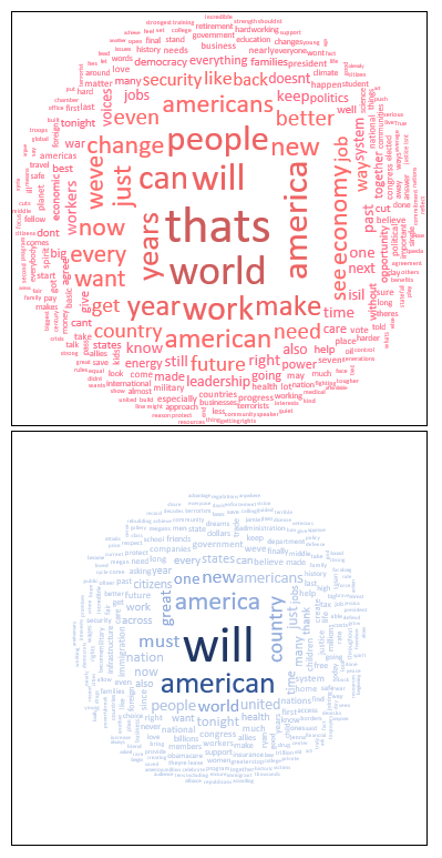 Obama's word cloud covers a wider range of topics (high number of keywords with a high frequency of occurrence). These terms are centered around the keyword world. On the other hand, Trump's cloud is built around the keywords will, american, and country.
¿Ha sido útil este artículo?
- Sí
- No