Funnel charts in Excel with XLSTAT
Dataset to generate a funnel chart
A company launches a marketing campaign to promote a new product, with the aim of attracting potential customers, converting them into leads and ultimately closing a deal with them.
The data are fictitious data representing the journey of these prospects through each stage.
Goal of this tutorial
The goal of this tutorial is to visualize in a simple way the path of prospects following a marketing campaign, and thus identify the number of prospects remaining in each of the phases until the stage of the deal closed with these prospects.
Setting up a funnel chart in XLSTAT
-
Once XLSTAT is open, select the XLSTAT menu / Data visualization / Funnel charts.
-
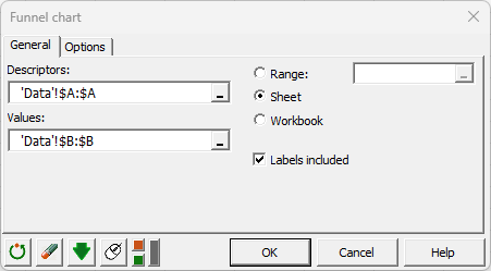
The dialog box pops up. On the General tab, select column A in the Descriptors field, and column B in the Values field.
-
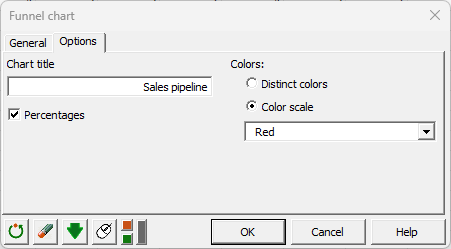
Then, different options are available to personalize the chart. Select Percentages and Color scale:
Interpreting a funnel chart
The funnel chart is then displayed.

You can very quickly see the gradual reduction in the number of leads as they move through the sales pipeline. The funnel chart shows the initial number of contacts was 2350, 52% were converted into qualified leads, and at the end, only 17% of contacts closed a deal.
This type of chart is very interesting because they are easily readable. Additionally, they use relative proportions, which makes them helpful for illustrating conversion rates or selection rates during a process.
Was this article useful?
- Yes
- No