Dynamic histograms tutorial in Excel
This tutorial will show you the two possible ways to create a dynamic histogram in Excel using the XLSTAT software. To create a classical histogram with XLSTAT, you can find a tutorial here. Two cases will be presented.
Data to create a dynamic histogram
Case 1
Setting up the dialog box to create a dynamic histogram (case 1)
In this case, we imagine we have used two techniques to make a measurement. The data have been recorded in two different columns, and the two samples are independent because measures were not taken simultaneously.
After opening XLSTAT, select the XLSTAT / Describing data / Histograms command, or click on the corresponding button of the Describing data toolbar (see below).
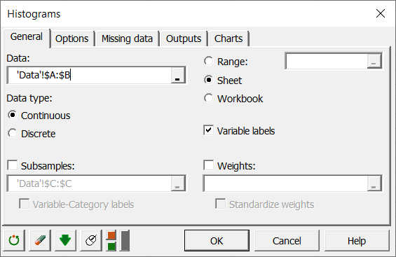
Once you've clicked on the button, the dialog box appears. Select the data on the Excel sheet.
The Data are in the A and B columns.
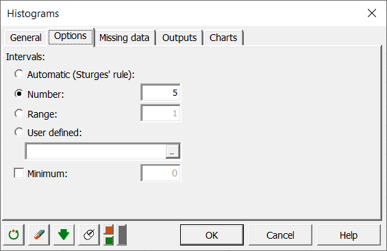
In the Options tab we set the number of intervals for the histogram to 5.
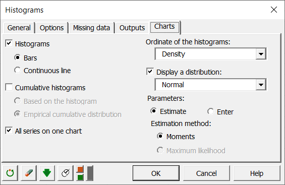
As we think the data should follow a normal distribution, we choose to display a normal distribution curve fitted to the data.
The computations begin once you have clicked the OK button. The results will then be displayed.
Interpreting a dynamic histogram (case 1)
The first chart is a dynamic histogram. The list box at the top left of the chart allows you to choose which sample is displayed in the front.
The second chart allows to see the two samples and the corresponding fitted normal distributions.
Case 2
Setting up the dialog box to create a dynamic histogram (case 2)
In this case, we imagine we have used a technique to make a measurement on a series of products. The measures have been recorded by two different operators (0 / 1). In an exploratory phase, we want to visually investigate whether they are different or not.
After opening XLSTAT, select the XLSTAT / Describing data / Histograms command, or click on the corresponding button of the Describing data toolbar (see below).
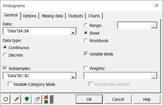
Once you've clicked on the button, the dialog box appears. Select the data on the Excel sheet.
The Data are in column A. The information telling which operator made the measurement is recorded in column C.
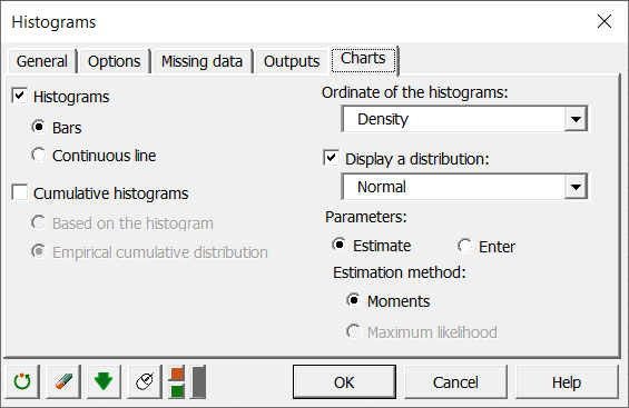
In the Options tab we set the number of intervals for the histogram to 5. We want to compare the samples so we activate the “Compare the subsamples” option. We also activate the “Compare to the total sample option” to see the distribution of the data taken all together.
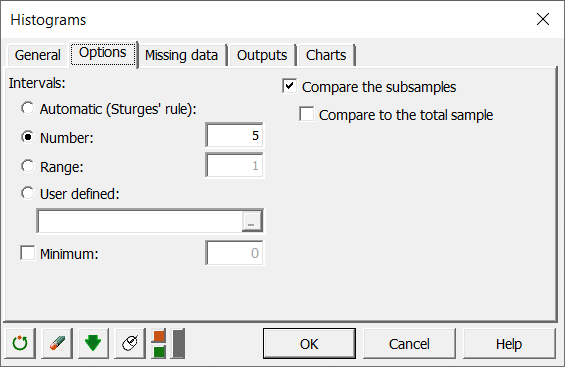
As we think the data should follow a normal distribution, we choose to display a normal distribution curve fitted to the data.
The computations begin once you have clicked the OK button. The results will then be displayed.
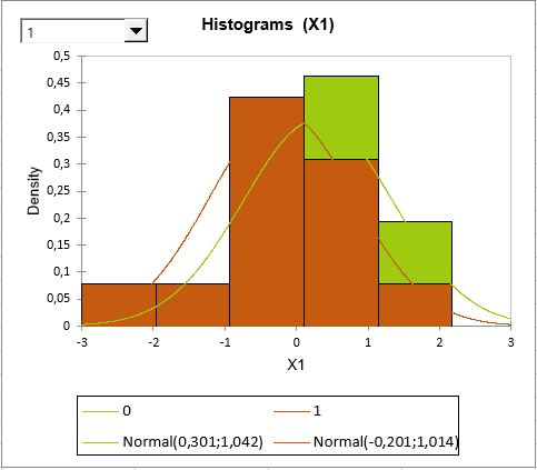
Interpreting a dynamic histogram (case 2)
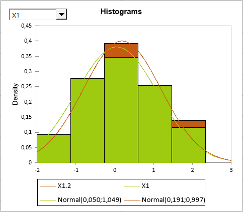
The first chart is a dynamic histogram. The list box at the top left of the chart allows you to choose which subsample is displayed in the front. X1 corresponds to the merged data. In the image above, it is in the background, hidden by the two subsamples.
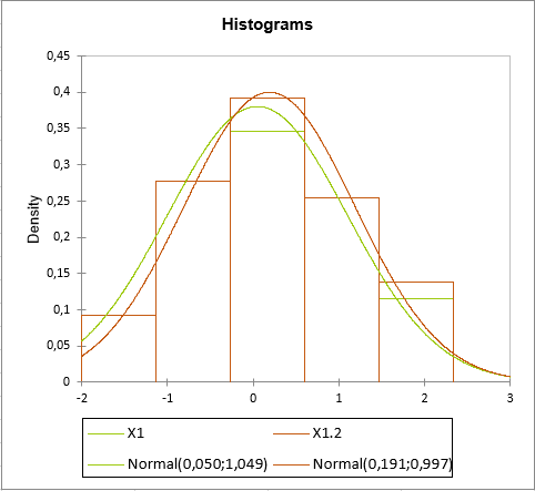
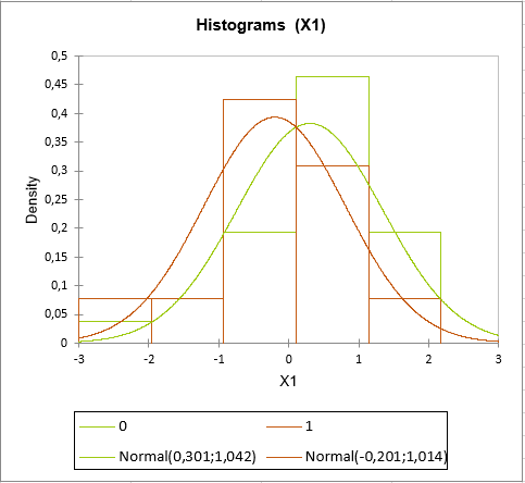
The second chart allows to see the two sub-samples corresponding to each operator and the normal distribution fitted to the total sample (it would be displayed for each sub-sample if the Compare to the total option had not been activated).
Was this article useful?
- Yes
- No